What is Pareto Chart and Pareto Analysis
What is Pareto Chart
A pareto chart is graphical tools used to display the relative performance of different factor that contribute to a specific result set.
It is represented with a bar chart sorted in descending order with the longest bar representing the factor that has the most impact on the result
What is Pareto Analysis
Pareto analysis is a method of identifying the most significant factor that contribute to a problem or result set.
To perform a pareto analysis you need to gather data that could be contributing to the result or a problem. Pareto analysis can be done by focusing on the most significant factor first, you can often achieve a significant improvement in the problem or result with relatively small effort.
Pareto analysis is mostly used in the quality control and process improvement to identify the most significant source of defect or problem in the process.
If you are trying to improve the quality of a manufacturing unit or process you might use pareto chart/analysis to determine the most common type of problem or defect.
Who Invented the Pareto Chart/Analysis
The Pareto chart was first invented by Vilfredo Pareto an Italian scientist in the early 20th century.
He observed the a small number of factor often had disproportionate impact on the system.
He later develop a concept of Pareto Principle, "Which state that originally 80% of the effect come from 20% of the cause"
How to Create Pareto Chart
Pleas follow the below steps to create Pareto chart
Step1. Identify the category of data that you want to analyze. This could be types of defect or types of customer complaint
Step2. Collect data on the frequency of the each category
Step3. Arrange these categories in descending order
Step4. Plot category in X axis and frequency on Y axis
Step5. Draw a line chart to show the cumulative total of categories
Pareto chart can be used in various places with variety of settings including business, engineering and manufacturing to prioritize the effort and resource allocation
- Pareto analysis can be used to identify the most significant defect in the manufacturing process, focusing the rout cause of problem
- To identify the most frequently occurring problem
- Determine the most significant factor that contribute to customer complaint
- To analyze the financial performance of a business unit
- Analyzing the cause of accident in the work place
- Analyzing the data of patient complaint in a hospital
- Analyzing data on equipment failure in a manufacturing sector
- Analyzing sales data for a business to find the cause of problem
- We can also analyze the data of a e-commerce website traffic to find the most popular product
What are limitations of Pareto Chart
- Pareto chart is based on pareto principle which says that only small number of factor responsible for the major problem but always it is not the case
- Pareto chart rely of subjective judgement of the problem
- It does not provide any information about cause and effect relationship
- This can mislead you if data not collected properly
Despite of the above limitation Pareto chart is widely used analysis tools in the moderns world.
Example of Pareto Chart
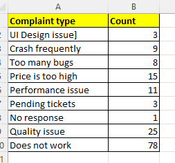
Here we will take an example of software complaint based on user input.
The column A contains the complaint type and column B contain the count of compliant type in a given period.
As we already have disused that the 80% of effect comes form 20% of cause.
As you know we have different version of MS Excel, If you are using the latest version of excel like 2016 onwards, you can create it very easily by just clicking in the suggested chart.
See the below picture, it will be easy for you
Select the Data then go to Insert menu you will see dialogue box, from that dialogue box select the Pareto chart from the list and click OK, as shown in the below figure


The pareto chart is created. You can bow customize your chart using various option available in the menu items like changing fonts, chart title, data grid and its various decoration.
Thank you friends, if you feel the information is valuable for you do share the post as much as you can
Suggested topic for you


No comments:
Post a Comment