What are The Advance Use of Google Sheet

What are The Advance Use of Google Sheet

Google Sheets is a powerful tool that can be used in a variety of business scenarios to organize, analyze, and share data. The cloud-based nature of Google Sheets allows us for real-time collaboration and access to data from any device with an internet connection.


In this blog we will discuss what are various usage of google sheet  with example in various industries.

So lets begin

1. One of the most useful features of Google Sheets is its ability to collaborate in real-time. This means that multiple users can edit a spreadsheet at the same time, which is incredibly useful for teams that need to work on a project together.

For example, a sale and marketing team can use Google Sheets to track the performance of their campaigns and make adjustments in real-time.


2. Another powerful feature of Google Sheets is its ability to automate repetitive tasks using google scripts/java script and macros.

This can save a lot of time and effort, especially for businesses that need to process large amounts of data on a regular basis.

For example you can take an example of  e-commerce business that use Google Sheets to automatically update their inventory levels based on sales data.


3. Google Sheets also has a wide range of charts and graphs that can be used to visualize data. This makes it easy to understand and communicate data to others.

For example a financial analyst can use Google Sheets to create a graph that shows the performance of a company's stock over time.


4. Pivot tables in Google Sheets can be used to summarize and analyze data in new and powerful ways. This feature is particularly useful for businesses that need to make sense of large amounts of data.

For example, a retail business can use Google Sheets to create a pivot table that shows the best-selling products by category and location.


5. Google Sheets also has a number of add-ons and plug-ins that can be used to extend the functionality of the application. This allows businesses to customize the application to their specific needs.

For example, a business can use the Google Analytics add-on to pull data from Google Analytics into a Google Sheet, which can then be used to create custom reports.


6. Google Sheets is also very cost-effective, it is free to use and is included with a Google account. This makes it an ideal choice for small businesses and startups that are working with tight budgets.


7. In addition, Google Sheets has built-in security features such as multi-factor authentication and encryption, which makes it a safe choice for businesses that need to protect sensitive data.


Conclusion: By and large we can say google Sheets is a powerful tool that can be used in a variety of business scenarios to organize, analyze, and share data.

Its real-time collaboration, automation capabilities, and visualization options make it a valuable asset for businesses of all sizes.

The ability to customize the application with add-ons and plug-ins, as well as its low cost, makes it an ideal choice for businesses that are looking for a cost-effective solution for their data management needs.

If you find this topic is useful for you please hit the like button and share this to your friends.


Thanks.

What is Pareto Chart and Pareto Analysis

What is Pareto Chart and Pareto Analysis

What is Pareto Chart


A pareto chart is graphical tools used to display the relative performance of different factor that contribute to a specific result set.

It is represented with a bar chart sorted in descending order with the longest bar representing the factor that has the most impact on the result

What is Pareto Analysis

Pareto analysis is a method of identifying the most significant factor that contribute to a problem or result set.

To perform a pareto analysis you need to gather data that could be contributing to the result or a problem. Pareto analysis can be done by focusing on the most significant factor first, you can often achieve a significant improvement in the problem or result with relatively small effort.

Pareto analysis is mostly used in the quality control and process improvement to identify the most significant source of defect or problem in the process.


If you are trying to improve the quality of a manufacturing unit or process you might use pareto chart/analysis to determine the most common type of problem or defect.


Who Invented the Pareto Chart/Analysis

The Pareto chart was first invented by Vilfredo Pareto an Italian scientist in the early 20th century.
He observed the a small number of factor often had disproportionate impact on the system.

He later develop a concept of Pareto Principle, "Which state that originally 80% of the effect come from 20% of the cause"

How to Create Pareto Chart

Pleas follow the below steps to create Pareto chart

Step1. Identify the category of data that you want to analyze. This could be types of defect or types of customer complaint

Step2. Collect data on the frequency of the each category

Step3. Arrange these categories in descending order

Step4. Plot category in X axis and frequency on Y axis

Step5    Draw a line chart to show the cumulative total of categories


 Pareto chart can be used in various places with variety of settings including business, engineering and manufacturing to prioritize the effort and resource allocation

  • Pareto analysis can be used to identify the most significant defect in the manufacturing process, focusing the rout cause of problem
  • To identify the most frequently occurring problem
  • Determine the most significant factor that contribute to customer complaint
  • To analyze the financial performance of a business unit
  • Analyzing the cause of accident in the work place
  • Analyzing the data of patient complaint in a hospital
  • Analyzing data on equipment failure in a manufacturing sector
  • Analyzing sales data for a business to find the cause of problem
  • We can also analyze the data of a e-commerce website traffic to find  the most popular product  

What are limitations of Pareto Chart

  • Pareto chart is based on pareto principle which says that only small number of factor responsible for the major problem but always it is not the case
  • Pareto chart rely of subjective judgement of the problem
  • It does not provide any information about cause and effect relationship
  • This can mislead you if data not collected properly
Despite of the above limitation Pareto chart is widely used analysis tools in the moderns world. 

Example of Pareto Chart


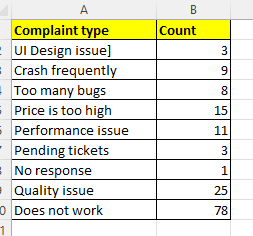
Here we will take an example of software complaint based on user input.

The column A contains the complaint type and column B contain the count of compliant type in a given period.


As we already have disused that the 80% of effect comes form 20% of cause.

As you know we have different version of MS Excel, If you are using the latest version of excel like 2016 onwards, you can create it very easily by just clicking in the suggested chart.

See the below picture, it will be easy for you

Select the Data then go to Insert menu you will see dialogue box, from that dialogue box select the Pareto chart from the list and click OK, as shown in the below figure


Once you click OK button a beautiful Pareto chart will appear, see the picture below


The pareto chart is created. You can bow customize your chart using various option available in the menu items like changing fonts, chart title, data grid and its various decoration.


Thank you friends, if you feel the information is valuable for you do share the post as much as you can

Suggested topic for you

Row Function in M S Excel

Row Function in M S Excel

Dear friends today I will discuss what is row function in excel, I will discuss in detail about it with 2-3 example, so be with us and read full blog


What is Row Function in Excel

Row function of excel provide unique sequence to each row number excel database or within the result data set.

See the below example, you can see each row has unique sequence number.


How Row function works in excel

Row function is a built in function of excel. It takes only one argument i.e. cell reference and give the row number.

=Row(A5) it will return 5
= Row(A6) it will return 6
=Row(10) it will return 10

Note here row function return the row number not the value of the cell

Example1

Here you can see the parameter/argument passed in the row function and its corresponding result

Let us understand with the help of one more example

Suppose you have to generate a serial number starting from row number 4 i.e. C4. From C4 for C10

the row function =ROW(C4) will give you result 4, but you want 1 at Cell C4. In such case your have to subtract 3 from that value like 

=ROW(C4) - 3, this will return 1 and if you drag down it will create a sequence form C4 to C10


Example2

    =ROW(A1:B10) - What it will return?
It will return 10 ,this means there is 10 rows available in the selected range.

Example3

If we want to count the number of available rows in the range A1:A1000, we can put the formula like =ROW(A1:A200)
In this case it will return 200, that means there is 200 rows available in the selected range or the count of available rows is 200 in the selected range 
 

Let us understand with some more example

Suppose you have list of student with name and roll number. As you know the roll number is both odd and even,

Now the task is to highlight the all the student having even roll number

Example4

This is the list of name of students with roll number at the end, 


Now the task is to highlight the Odd row number with green color

There are various way to achieve this task, I am showing my own way you pleas show your way in comments


Step1. Go to Conditional formatting in home section and then choose New rule


Step2. Once you click on the new rule, a new dialogue box will appear. From that dialogue box choose the last option Use formula to do formatting and put the formula below the box highlighted


Step3. In the below text box put formula =EVEN(ROW())=ROW()
            
Step4. Select the desired color you want and select OK


And you will get the result.

For more such amazing excel technique, please visit our You tube channel  Crazy Excel Tricks

Also visit

For more clarity pleas visit the below link


How to Convert Number to Text in MS Word

 How to Convert Number to Text in MS Word

Dear Friends today in this blog I will discuss, how to convert number to text in MS Word.

Friend you often face problem in converting number to text, specially if the number is to long. In that case its too difficult to convert in text.


To convert number to text you need to activate the calculation features of MS Word


To activate this calculation  press Ctrl + F9

Let say for example I want to convert the number 3549 to text

Step 1. Write the number you want to convert to text

Step 2 . Select the number using shift + arrow or using mouse

Step 3. Press Ctrl + F9

Once you press ctrl + F9 the word will be covered automatically in curly bracket({})


Step 4. Just before the number put =(equal sign)

             and after the number put \ (slash sign) and then put the text *cardtext

Step 5. Right click on the number and select update value


Once you click on the update value the number will be converted in to text


Once you click on the update value, it will show three thousand five hundred forty-nine


For more clarity pleas visit the below link


Calculate Features in M S Word

Calculation Features in M S Word


Dear Friend in this blog I will discuss, how to activate calculation features in M S word and how to activate calculation.

I will also show how to perform a simple calculation M S word.

To active the Calculation features in M S Word

1. Go to File menu
2. Select the option
3. Them choose Quick Access Tool bar
4. From that quick access tool bar choose All Command
5. and finally Choose the calculate option

Or 

Alternatively you can also perform the short cut key to activate calculation M S Word

Press Control + E 

A curly bracket { } will appear put all the calculation within that bracket and right click over that and select update cell, you will see the result

For Example

    {=500*30/100}

Once you right click over it, it will give you the desired result.        

See the below example


Also see the below video it will give you more clarity


Visit my You tube channel Crazy Excel Tricks for more interesting and informative videos


Here I have given you only one example, you can try many more and even it is capable to do more complex calculation

You ca try using creating table in M S Word and perform calculation like we do in M S Excel.


What Is Fuzzy Lookup In Excel

What Is Fuzzy Lookup In Excel  Fuzzy text matching is the process of finding text strings that are similar, but not exactly identical to a g...